The Power of Color Theory in Architecture: A Guide to Color Harmony
Introduction
Color is more than just an aesthetic choice in architecture—it plays a fundamental role in shaping perception, influencing emotions, and defining the functionality of spaces. Color theory in architecture helps designers create balanced, visually appealing environments that enhance both form and function. Whether designing a cozy home, a vibrant commercial space, or a serene office environment, understanding color harmony in architecture and its application in design is essential.
In this guide, we explore color theory in architecture, breaking down its principles, how to achieve color harmony, and the best color palettes for architecture to use in different design scenarios. By the end of this article, you will have a solid understanding of how to integrate color theory into your projects to create stunning, emotionally impactful spaces.
Why Color Matters in Architecture
Architectural color choices influence everything from mood and atmosphere to spatial perception and functionality.
- The Psychological Impact of Color
Color has a profound effect on human psychology. It can evoke emotions, improve productivity, and even alter perceptions of space.
- Red: Encourages energy and passion, often used in restaurants and entertainment spaces.
- Blue: Creates a calming effect, ideal for offices and healthcare environments.
- Green: Associated with balance and nature, perfect for relaxation areas.
- Yellow: Sparks creativity and positivity, making it a great choice for workspaces.
- The Role of Color in Space Perception
Color can make a space feel larger, smaller, warmer, or cooler:
- Light colors expand spaces and enhance brightness.
- Dark colors create intimacy and add a sense of depth.
- Warm tones bring warmth to large, open spaces.
- Cool tones enhance tranquility and reduce visual clutter.
The Basics of Color Theory in Architecture
Understanding color relationships is essential for harmonious design. The color wheel serves as the foundation of color selection, guiding architects and designers in creating aesthetic and functional color schemes.
- The Color Wheel: Understanding the Fundamentals
- Primary Colors (Red, Blue, Yellow): The building blocks of all other colors.
- Secondary Colors (Green, Orange, Purple): Created by mixing two primary colors.
- Tertiary Colors: Formed by mixing a primary and secondary color.
- Color Properties That Affect Architectural Design
- Hue: The actual color (e.g., red, blue, green).
- Saturation: The intensity or purity of a color.
- Brightness (Value): The lightness or darkness of a color.
Color Harmony in Architecture: Creating Balanced Spaces
Color theory in architecture is essential for creating harmonious environments. Color harmony in architecture ensures that colors work well together, creating a visually pleasing and functional space. Here are the most common color harmony techniques architects use:
- Monochromatic Color Scheme
A single color is used in various shades and tints.
- Best For: Minimalist and modern architecture.
- Example: A room designed in varying shades of blue for a cohesive and calming effect.
Two colors opposite each other on the color wheel.
- Best For: High-energy and dynamic spaces.
- Example: A red and green color combination to create bold contrast in retail spaces.
- Analogous Color Scheme
Three colors next to each other on the color wheel.
- Best For: Harmonious and natural-looking spaces.
- Example: Yellow, orange, and red used in warm, inviting interiors.
- Triadic Color Scheme
Three evenly spaced colors on the color wheel.
- Best For: Balanced yet vibrant spaces.
- Example: Blue, red, and yellow in educational institutions to stimulate creativity.
- Split-Complementary Color Scheme
A base color paired with two colors adjacent to its complement.
- Best For: Balanced contrast without overwhelming the space.
- Example: A green base with red-orange and red-purple accents in office environments.
Best Color Palettes for Architecture
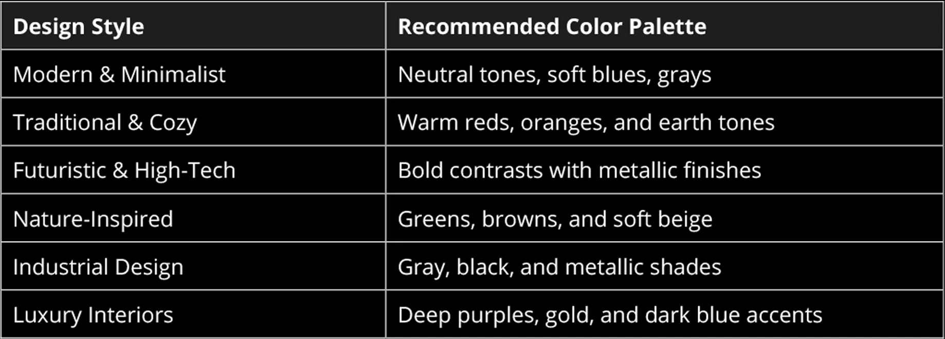
Selecting the right color palette is crucial in creating a visually balanced and functional space. Here are some ready-to-use color palettes for different design needs:

Using these palettes can help create cohesive environments that align with the intended function of a space.
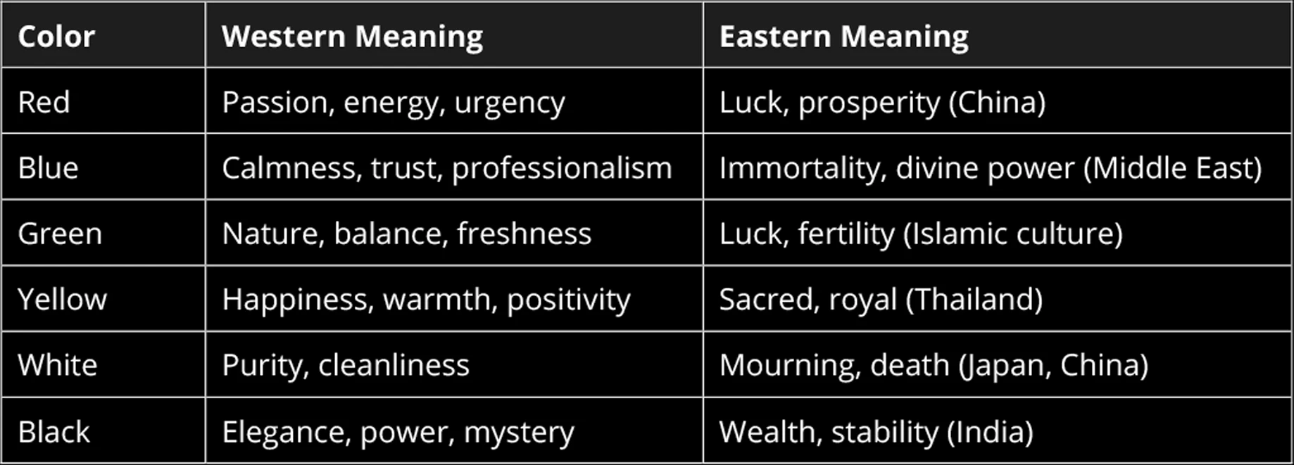
Cultural Meanings of Color in Architecture
Different cultures associate colors with various emotions and meanings. Here’s a breakdown of how colors are perceived across cultures:

Frequently Asked Questions (FAQ)
Light colors such as white, beige, and soft pastels help make small rooms feel more open and spacious.
- How does color affect building temperatures?
Dark colors absorb heat, making spaces warmer, while light colors reflect heat, keeping interiors cooler.
- Why is color theory in architecture important?
It helps architects and designers create functional, visually appealing spaces that enhance emotions, productivity, and spatial perception.
Conclusion: How Will You Use Color Theory? 💬
Mastering color theory in architecture allows architects and designers to create visually stunning and functionally effective spaces. By understanding color harmony in architecture, using color in architecture effectively, and applying the best color palettes for architecture, professionals can craft designs that enhance mood, improve usability, and leave a lasting impact.
📌 How do you use color in your designs? Share your experiences in the comments!


