Color Psychology in Architecture: Influencing Emotions Through Space
Introduction
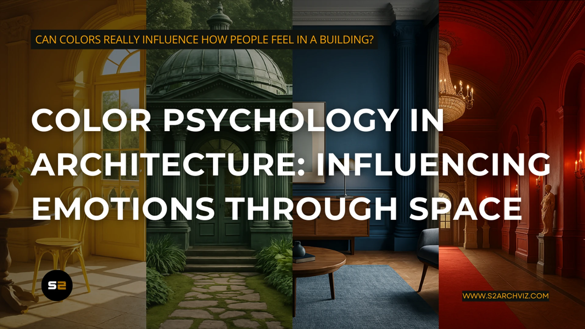
Have you ever stepped into a room and instantly felt calm—or maybe a little anxious? That wasn’t a coincidence. It was color psychology in architecture at work. In architectural design, color isn’t just decoration; it’s a powerful emotional and psychological tool. From healthcare clinics to creative workspaces, colors shape how we feel, interact, and perform in a space.
This article explores the role of color psychology in architecture, how it influences human emotions and behaviors, and how you can apply it effectively in your designs. Whether you’re designing a cozy home, a public space, or a bold commercial interior, mastering color psychology can make all the difference.
Why Color Psychology Matters in Architecture
Color decisions aren’t just aesthetic—they’re strategic. Each color triggers a unique psychological response, which architects and designers can harness to support a space’s function.
Emotional Influence of Color
Colors influence our mood, perception, and behavior:
- Red: Increases energy and adrenaline. Ideal for active zones like gyms or dining areas but can feel overwhelming in excess. Red stimulates the sympathetic nervous system, often evoking urgency or excitement.
- Blue: Calms and focuses the mind. Perfect for offices, bedrooms, and healthcare facilities. Blue reduces heart rate and is associated with reliability and logic.
- Green: Brings harmony and freshness. Often used in wellness centers, classrooms, and biophilic design. Green is restful for the eyes and associated with growth and healing.
- Yellow: Stimulates optimism and creativity. Great for kitchens, studios, and social spaces. Yellow increases serotonin levels, promoting a cheerful atmosphere.
- Purple: Evokes luxury and introspection. Often seen in upscale interiors or relaxation rooms. Purple stimulates imagination and conveys depth.
- Orange: Combines the cheerfulness of yellow and the energy of red. Often used in retail and recreational spaces to foster enthusiasm.
- Black and White: Black signifies elegance or power, while white represents clarity and simplicity. Together, they create bold contrast and balance.
Behavioral Impact
Color can:
- Encourage productivity in work environments
- Enhance relaxation in living spaces
- Boost appetite in restaurants
- Foster healing in hospitals
- Create brand recognition in commercial architecture
When chosen purposefully, colors can support a space’s function and improve the occupant experience.
Color in Traditional Architecture
In many cultures, traditional architecture used color symbolically to convey meaning, hierarchy, spirituality, or community identity.
- Islamic Architecture: Deep blues and turquoise represent divine infinity and spiritual calmness. Complex geometric patterns in green and gold reinforce a sense of order and paradise.
- Chinese Architecture: Red is a color of good fortune and is used in palaces, temples, and gates. Yellow, reserved for the emperor, symbolizes power and the center of the universe.
- Japanese Architecture: Natural, muted tones reflect harmony with nature. Whites and woods dominate interiors to foster simplicity and mindfulness.
- Mediterranean Architecture: Earthy tones, terracotta, and bright blues reflect the landscape and coastal light, grounding the structure in its environment.
These examples show how color is not only aesthetic but also a tool for cultural storytelling and symbolism.
The Role of Color in Conveying Meaning and Concept
Beyond mood regulation, color can also communicate abstract ideas and guide behavior.
- Identity & Branding: Companies and institutions use color in architectural design to express values and evoke associations. For example, a bank might use blue for trustworthiness, while a children’s center might use bright primaries to suggest playfulness.
- Wayfinding: Color-coded hallways or zones help users navigate large spaces like hospitals or airports.
- Hierarchy & Function: Darker tones can denote formality or importance, while lighter shades suggest openness or accessibility.
- Spiritual or Emotional Themes: Sacred spaces often use specific colors to evoke transcendence or reflection.
Using color conceptually adds depth and intentionality to design, reinforcing messages beyond the physical structure.
Color Psychology by Space Type
Different environments demand different emotional responses. Here’s how to apply color psychology in architectural spaces:
- Use cool tones like soft blues and greens in bedrooms to promote rest.
- Add warm accents like yellows or oranges in living and dining areas to foster sociability.
- Earthy tones like terracotta, beige, and olive green bring warmth and timelessness to interiors.
- Blues and greens reduce stress and improve concentration.
- Pops of red or yellow in breakout spaces can spark innovation and energy.
- Neutrals with vibrant accents support professionalism without being boring.
- Retail Environments
- Red and orange stimulate urgency—ideal for sales zones.
- Neutral or pastel backdrops help products stand out.
- Color zoning can guide traffic and influence purchase behavior.
- Healthcare Facilities
- Use soft greens and blues to promote a sense of calm and healing.
- Avoid intense reds or bright yellows, which can overstimulate.
- Lavender and sage are increasingly used for their therapeutic qualities.
- Combine cool shades in study areas with warm tones in collaborative spaces.
- Natural hues improve comfort and focus.
- Accent walls in bright, inspiring colors can stimulate creativity.
Cultural Considerations in Color Psychology
Colors don’t carry the same meaning across all cultures. For global projects, cultural color sensitivity is essential.


Using Color Effectively in Architectural Design
Here are a few professional design tips for applying color psychology in architecture:
✅ Plan by Purpose
Always start by asking: What emotion or behavior should this space promote?
✅ Consider Lighting
Colors shift under different lighting conditions. Always test paint or material samples in situ.
✅ Use Color Accents Strategically
Bright colors can energize, but use them in moderation to avoid overstimulation. Accent walls, furniture, and art can introduce bold hues without overwhelming the space.
✅ Balance with Neutrals
Neutral colors help balance bolder hues and create a more timeless design.
✅ Respect the Architecture
Color choices should enhance—not fight—the natural geometry and character of the space.
✅ Test with Users
Where possible, use mockups or digital visualization to test how end-users respond to color before finalizing designs.
Color Palettes for Common Architectural Styles

FAQ: Color Psychology in Architecture
Q1: Can colors really influence how people feel in a building?
Yes! Studies in environmental psychology show clear links between color and human emotions, performance, and stress levels.
Q2: What’s the most universally calming color?
Soft blues and light greens are widely recognized for their calming effects.
Q3: Is there a color that improves focus?
Blue is often used in learning and work environments to enhance focus and productivity.
Q4: Should I avoid using red in architecture?
Not necessarily—it depends on how it’s used. Red is excellent for stimulating spaces but should be balanced with neutrals.
Q5: Can I use bold colors in minimalist designs?
Absolutely. A minimalist design can still include bold colors as accents to create striking focal points.
Conclusion
Color psychology in architecture is more than a design trend—it’s a transformative principle that allows you to shape how people feel, think, and interact within a space. By understanding color’s psychological impact, cultural meanings, and functional applications, you can create deeply resonant and emotionally intelligent architecture.
Have you ever designed a space where color changed the mood?
Share your thoughts in the comments—we’d love to hear them!
And if you’re seeking high-end visualization services, S2ArchViz is here to bring your designs to life. 🎯
💡 You might also like to read these articles:
- 🔗 The Power of Color Theory in Architecture: A Guide to Color Harmony
Explore how color harmony enhances architectural impact and emotional balance. - 🔗 V-Ray vs Corona Renderer: Which Is Better for Architectural Visualization?
Understand how Index of Refraction works in realistic material creation using Corona Renderer. - 🔗 AI in Architecture: How Artificial Intelligence is Transforming Design & Visualization
See how cutting-edge tools are reshaping the creative process—including color decisions.